Deploying SharePoint 2010
Information Architecture, Branding and Usability and of a Sharepoint Foundation 2010 Site
The following is the steps to create a "Best in Class" SharePoint 2010 Intranet from an existing SharePoint 2003 site.
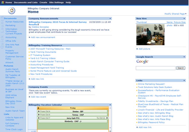
The initial intranet was built on SharePoint 2003. Only IT and HR used the site at all. The rest of the organization saw little to no value in the intranet and found it hard to navigate as well as the content they needed wasn't there. The navigation was poorly designed making it hard to tell exactly what content was actually on the site.
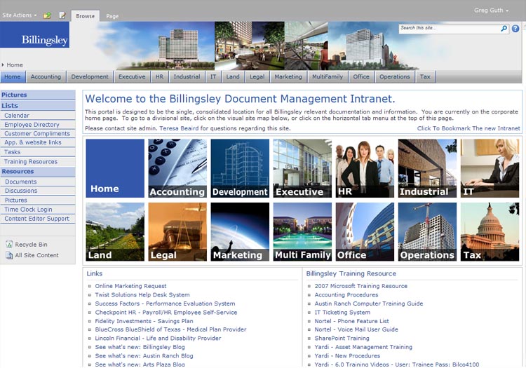
The first and most important step was to create a clean Information Architecture for the site. Primary and secondary navigation was designed for the site. The primary navigation was simply the departments of the small Billingsley organization. Most companies this would simply be a dropdown of the main navigation. Billingsley was unusual as the departmental structure was the primary navigation these will all be departmental sub-sites. This navigation will be on all pages throughout the site so from any location employees will always be able to find their way around the site. The left navigation from the 2003 site was completely reorganized into a simple to understand heiarchy. Instead of many links to random image and document libraries, an images and document home page was created. This way a sinle link to Images and Documents could be added to the left navigation. This completely cleaned up the left navigation area. The new left nav has been organized into to Pictures, Lists and Resources. The main page was updated to have the unused sections removed so only valid and current content remained. This site based on the out of the box Azure theme is already much easier to navigate with just the IA reworked.
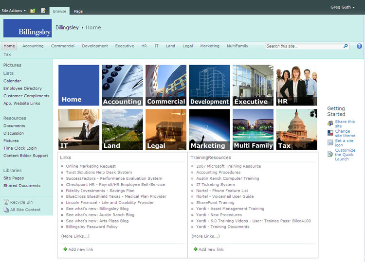
To improve the navigation further the search area needed to be removed from the nav bar to make more room, the breadcrumb string was moved to the left bottom area to keep it from impacting the logo area. The left navigation area was colored to match the marketing prototype design developed prior to the site creation. This was done by developing a custom theme, CSS override and a custom Master Page. The result was a clean site with navigation colored to be easy to read, using brand colors andfollowing the prototype design.